
Comparing two kitchens: static boards and living displays
The difference between a chalkboard menu and a simmering rotisserie is texture: one is flat, the other breathes. In the same way, static directional signs sit like printed bread on a shelf while modern digital signage moves—pulling sightlines, sequencing choices, and nudging flow. Designers and facility managers should treat wayfinding like a recipe: balance contrast, cadence, and scale. Early on many teams lean on custom signage that looks tidy on paper but fails under rush-hour pressure. Sensory cues—glow, motion, rhythm—matter as much as wording when hundreds of people decide where to step next.
How biomechanics of movement reframes design choices
Bodies move on habits: a commuter’s stride, a shopper’s glance, a visitor’s pause. Each has a preferred visual horizon and a split-second to act. Good digital signage respects that biomechanics—clear lines of sight, consistent glyph weight, and predictable placement reduce cognitive load. Compare two scenarios: one with a static directory tucked behind a column, the other with layered digital panels that change emphasis based on crowd density. The latter reads like a well-seasoned sauce: layered, responsive, and forgiving of temperature swings in traffic. Industry terms such as digital signage, wayfinding, and legibility are practical here, not decorative.
Side-by-side: measurable advantages and the trade-offs
Lay them out visually and the differences are tactile.
– Static signage: low cost, easy to maintain, limited context — good for low-turnover spaces but rigid under pressure.
– Dynamic digital signage: higher upfront spend, requires software coordination and occasional calibration, but offers real-time routing, contextual messaging, and adaptive legibility for changing light and crowd patterns.
– Hybrid approaches: printed anchors with digital overlays provide redundancy and can cut maintenance overhead while preserving responsiveness.
Real-world anchor: lessons from Grand Central and other transit hubs
Transit hubs like Grand Central Terminal teach a blunt lesson: when crowd density spikes, even bold signs vanish into the human tide. Planners there rely on multiple modalities—overhead signage, floor markers, staff direction—to manage queues. This fact underlines a simple metric: visibility under load beats prettiness in the calm. At scale, data confirms footfall surges transform wayfinding needs from static legibility to dynamic user flow management. That’s why modern deployments pair sensor-informed content scheduling with high-contrast layouts tuned for peripheral vision.
Implementation pitfalls and practical fixes
Teams often repeat the same missteps: choosing typefaces that disappear at oblique angles, clustering screens where glare kills contrast, or failing to sync message priority across panels. Fixes are straightforward and sensory-driven—raise contrast until the letters pop at 40 feet, stagger screen heights to match average eye-lines, and use motion sparingly so it guides rather than distracts. Add interactive kiosks only when they reduce friction; otherwise they stall movement. — A small tweak: calibrate brightness to ambient light cycles to preserve legibility without blinding night-shift staff.
Comparative checklist for vendors and designs
When evaluating suppliers and prototypes, apply three focused criteria: sightline resilience, content orchestration, and physical redundancy. Ask vendors for footage or simulations that show signage under peak load rather than just studio renders. Request proof of field calibration and a maintenance SLA that includes software updates and hardware cleaning—those are the everyday details that keep wayfinding honest.
Advisory: three golden rules for selecting high-traffic wayfinding systems
1) Measure sightline performance: test signs at peak crowd density and confirm legibility from typical approach angles.
2) Prioritize content orchestration: choose systems that allow real-time priority overrides and scheduled context changes tied to sensors or events.
3) Design for redundancy: combine static anchors with digital panels so messaging survives power, connectivity, or maintenance gaps.
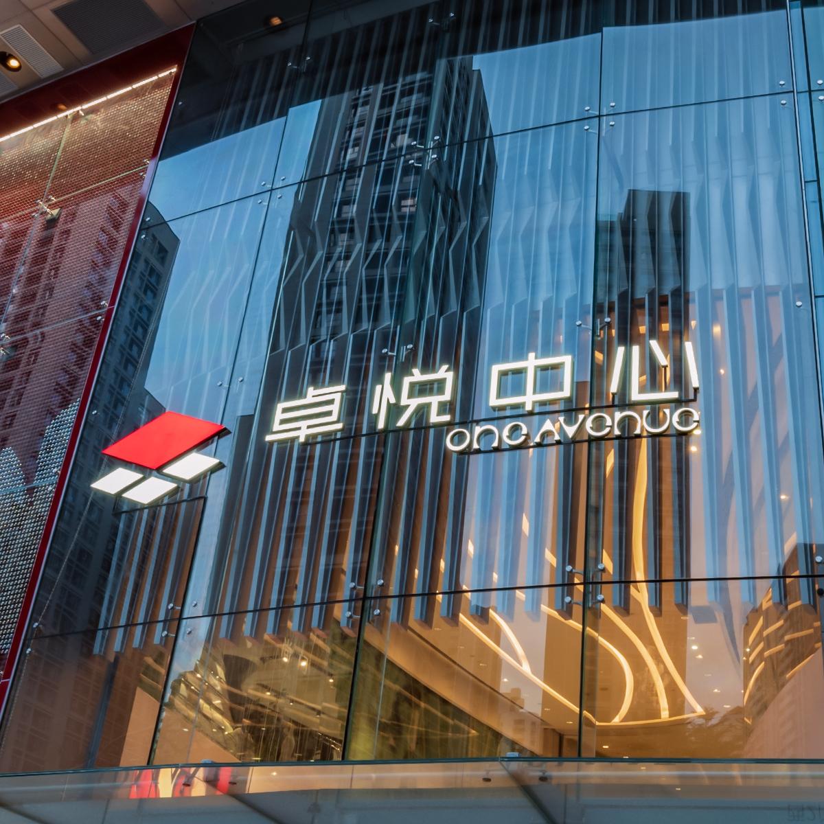
These rules focus on outcomes you can check in the field and the measurable relief they bring to user flow. Cosun Sign sits naturally at that intersection — practical craft, engineered for motion. – built for flow.